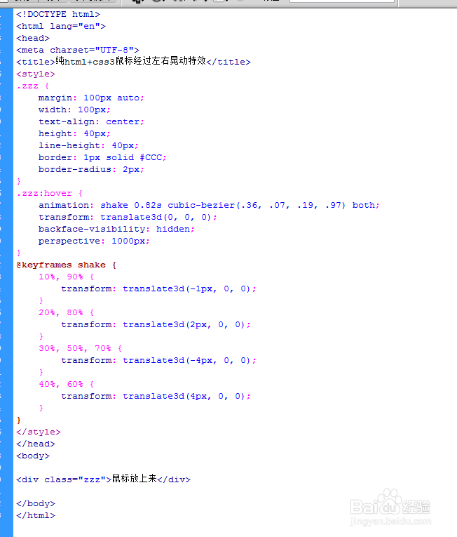
1、新建html文档。

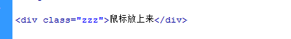
2、书写hmtl代码。<div class="zzz">鼠标放上来</div>
3、书写css代码。
<style>
.zzz {
margin: 100px auto;
width: 100px;
text-align: center;
height: 40px;
line-height: 40px;
border: 1px solid #CCC;
border-radius: 2px;
}
.zzz:hover {
animation: shake 0.82s cubic-bezier(.36, .07, .19, .97) both;
transform: translate3d(0, 0, 0);
backface-visibility: hidden;
perspective: 1000px;
}
@keyframes shake {
10%, 90% {
transform: translate3d(-1px, 0, 0);
}
20%, 80% {
transform: translate3d(2px, 0, 0);
}
30%, 50%, 70% {
transform: translate3d(-4px, 0, 0);
}
40%, 60% {
transform: translate3d(4px, 0, 0);
}
}
</style>

4、代码整体结构。
5、查看效果。
